-
Yerevan Place Hotel Rebranding
YPH Business Hotel was built on the values of convenience, discovery, and a commitment to excellence. Located in the heart of Yerevan, it reflects the city’s rich history, culture, and dynamic business environment.
The collaboration between MAROG and YPH resulted in a complete change in the brand’s visual identity, as well as an optimization of the brand name. Today, Yerevan Place Hotel is known for its exceptional service, personalized attention to guests, and high standards of hospitality.
-
DELIVERABLES
REBRANDING
LOGO DESIGN
MARKET RESEARCH
DESIGN OF PRINT MATERIALS
DESIGN OF DIGITAL MATERIALS
ACCESSORIES DESIGN
CORPORATE IDENTITY
BRAND TAGLINE
VERBAL BRAND PLATFORM
COMMUNICATION PLATFORM
-
CLIENT
.jpg)
.jpg)
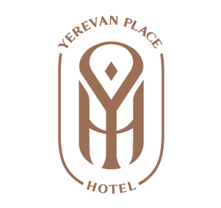
The brand’s previous name, Yerevan Place, which was based on search engine results and keywords on the digital platform, did not do it justice. Following research across various search engines, the team retained the core keywords while adding "Hotel" to enhance brand recognition and clearly communicate its purpose to tourists.
The logo concept consists of a monogram of the letters Y, P, and H. At first glance, it resembles a key, which speaks to the brand’s values, but it also encapsulates the semicircle of Republic Square, symbolizing the hotel’s location. The incorporation of this monogram refined the logo, giving it a sophisticated yet clean and minimal aesthetic. In addition to the combined use of letters in the logo, the letters of the brand name are also used separately. Thus, the monogram of the letters Y and P is used as a visual pin across brand materials.
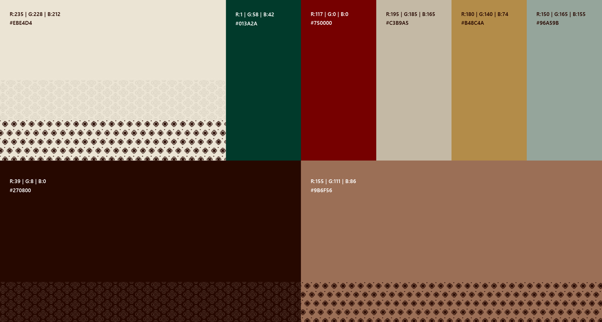
In addition to the main logo, we created four additional color applications of the logo for the various services available in the hotel. Thus, we used the gold color of the logo in the restaurant, burgundy in the gym, emerald in the spa, and gray in the laundry facilities. These four colors are also used as secondary colors of the brand.
.jpg)
.jpg)
.jpg)
.jpg)
Additional design elements include branded materials for social media, decorative ornaments, staff uniforms, and the branding of various items used throughout the hotel, ensuring a consistent and cohesive visual identity.
The brand's visual identity strongly reflects its main pillars: safety, security, and comfort. These principles define the guest experience, ensuring a high standard of hospitality. Committed to these values, the brand consistently delivers a stay that prioritizes well-being and quality, reinforcing its promise to every guest.
.jpg)
.jpg)
.jpg)
.jpg)
.jpg)
.jpg)
.jpg)
.jpg)
.jpg)