-
KAYTAR fish products branding
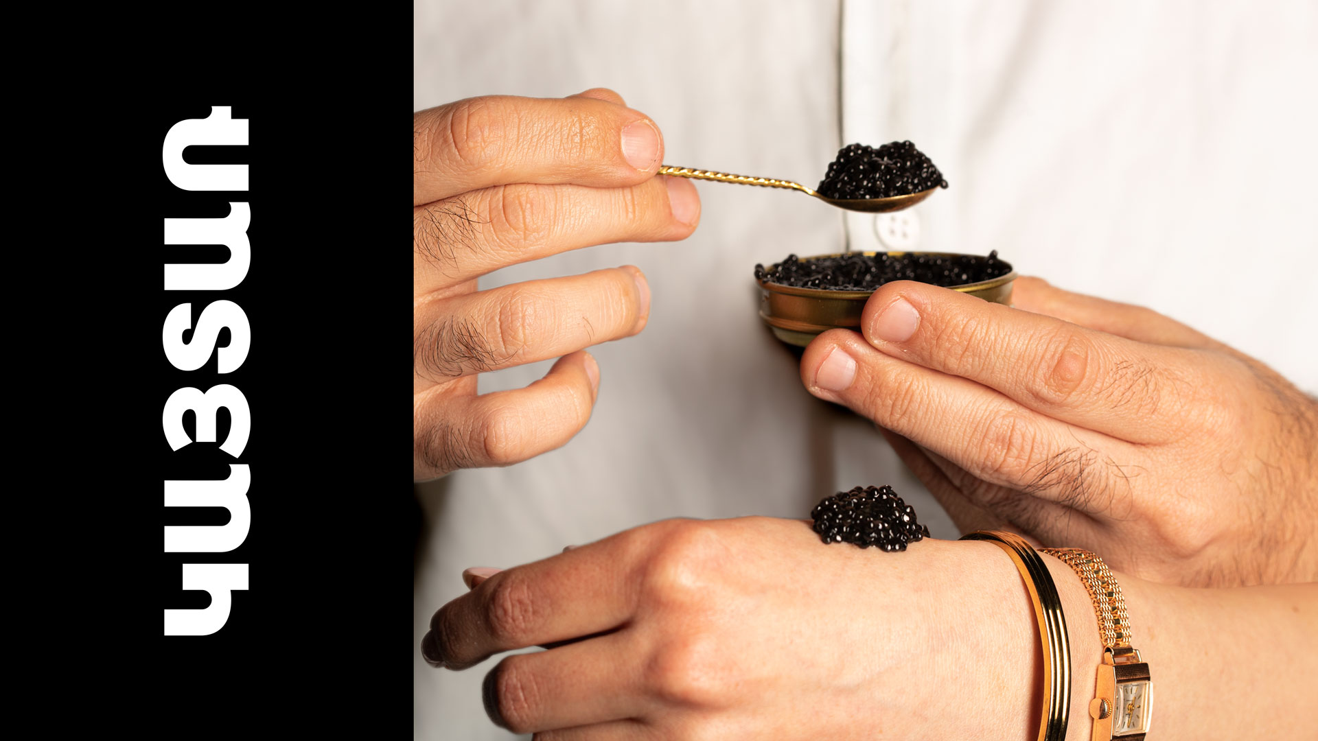
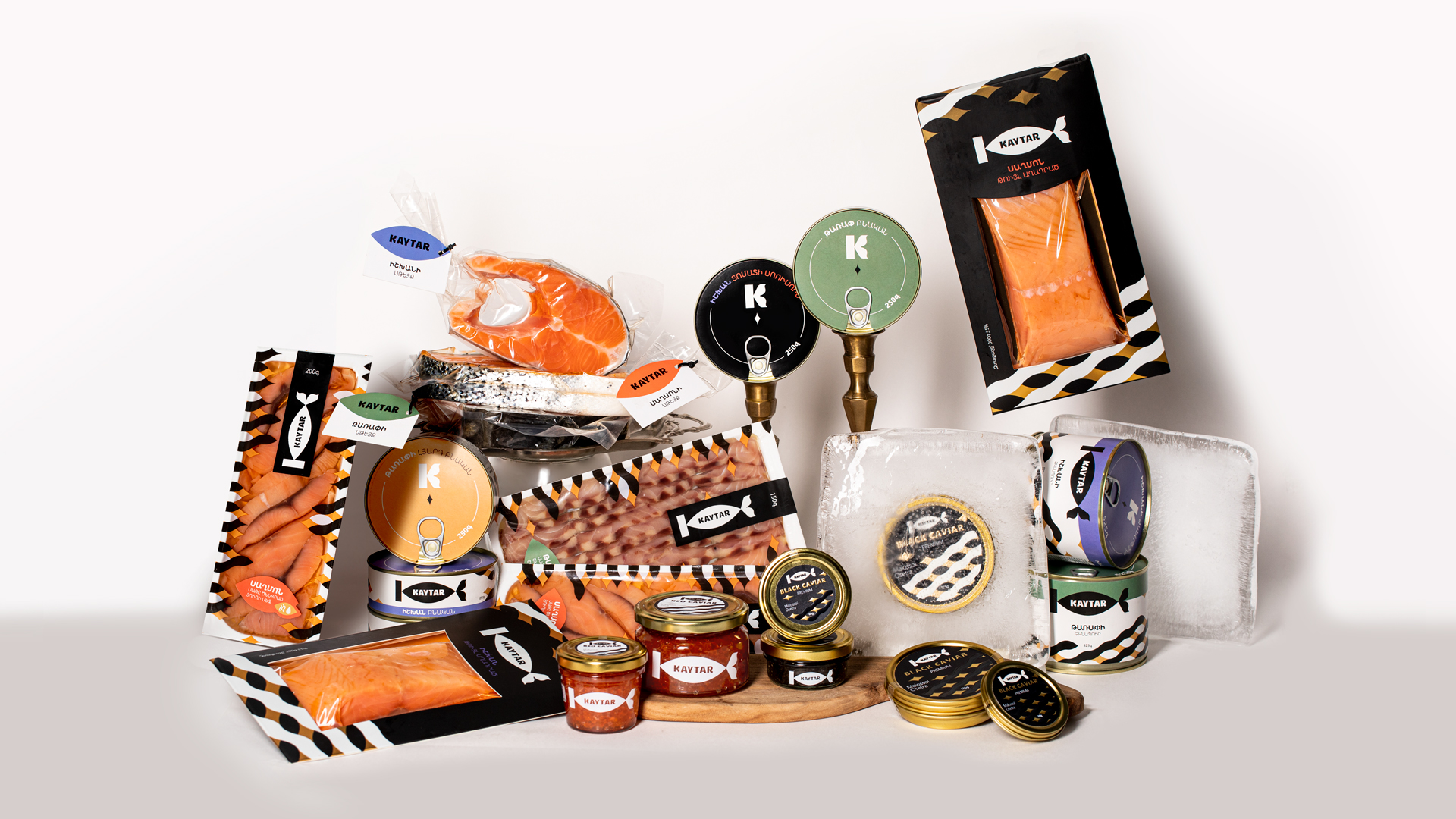
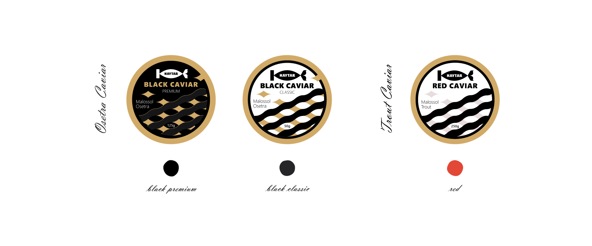
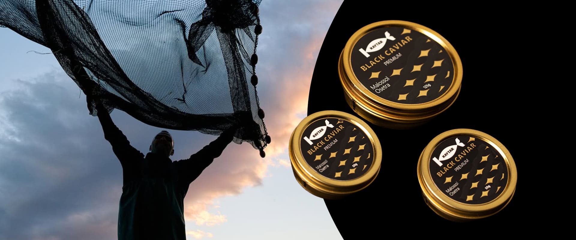
KAYTAR, a fish products brand, established in 2023, offers a diverse range of over 20 products, including trout, Atlantic salmon, sturgeon, red and black caviar. As a result of the cooperation between MAROG and KAYTAR, a fresh and vibrant brand was crafted featuring a dynamic and lively name, a striking visual identity, a unique verbal tone, and a thoughtfully developed value system.
-
DELIVERABLES
BRANDING
LOGO DESIGN
CORPORATE IDENTITY
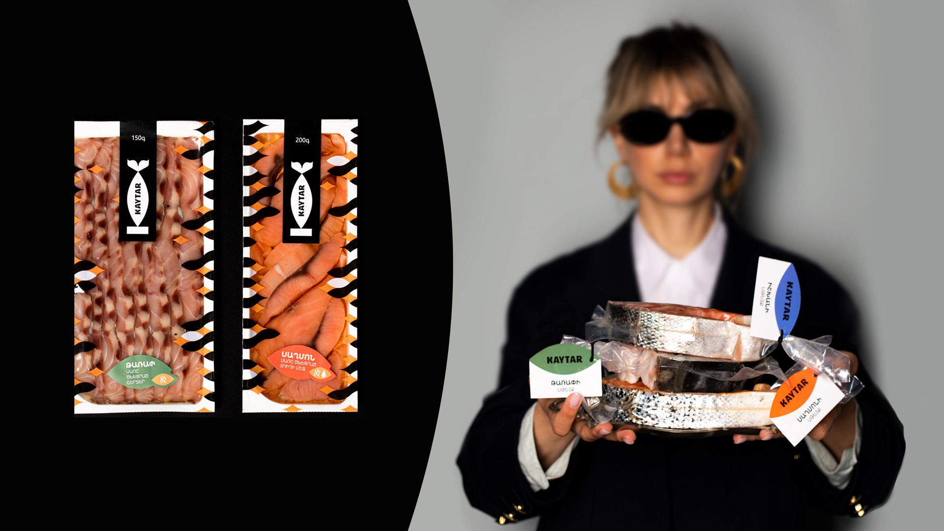
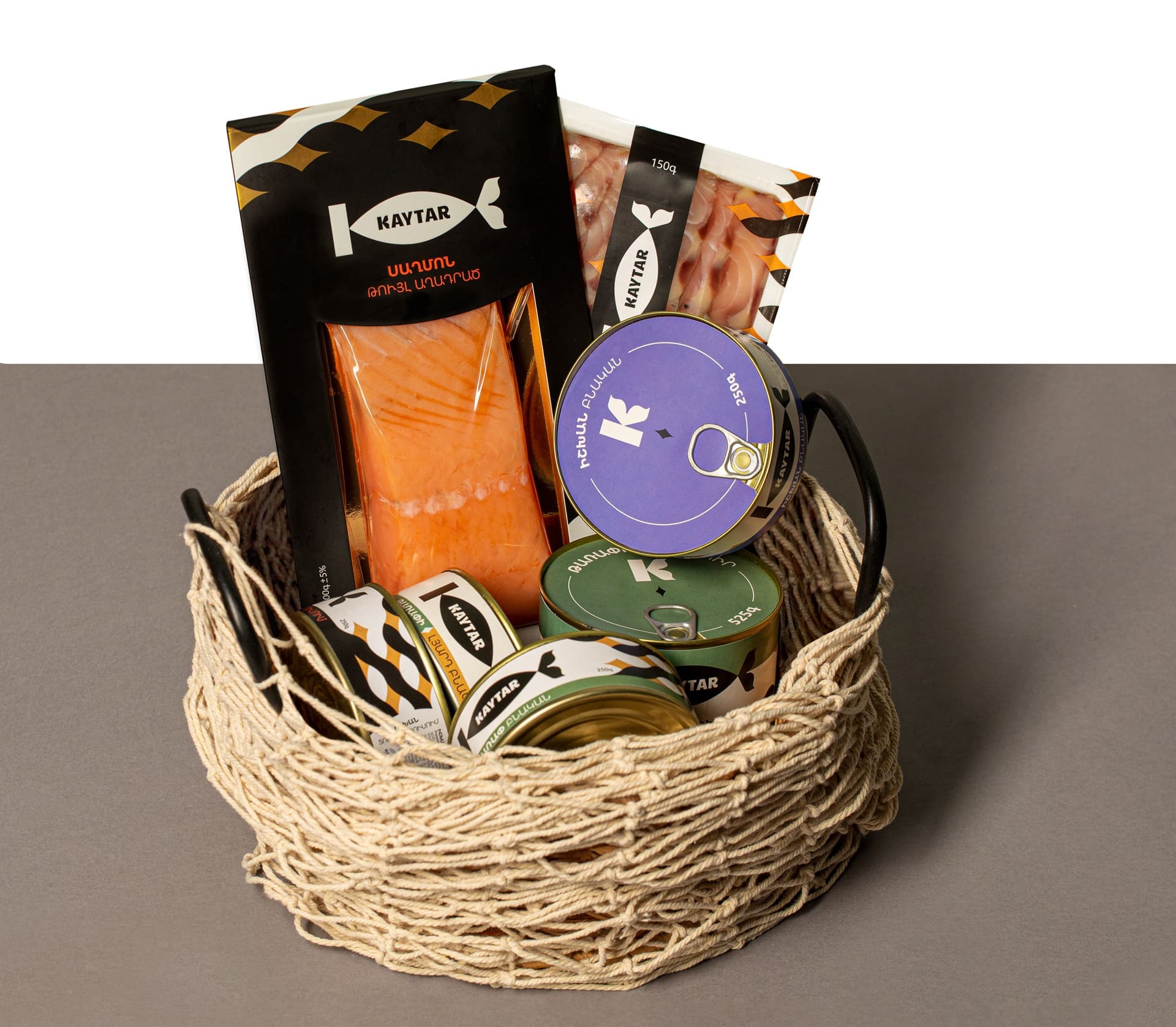
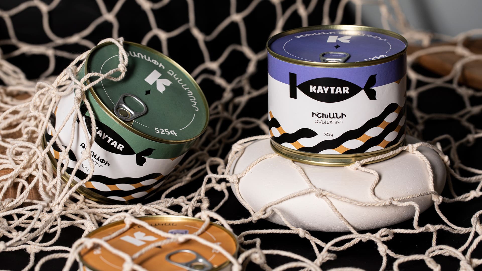
LABEL DESIGN
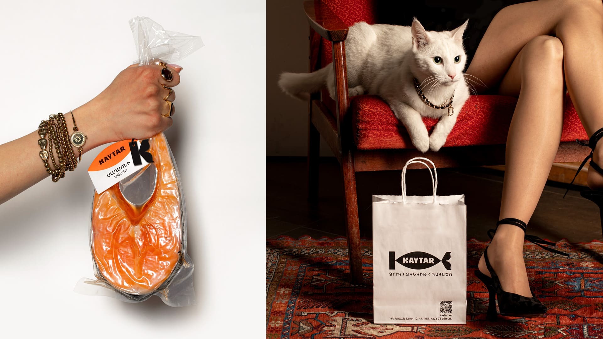
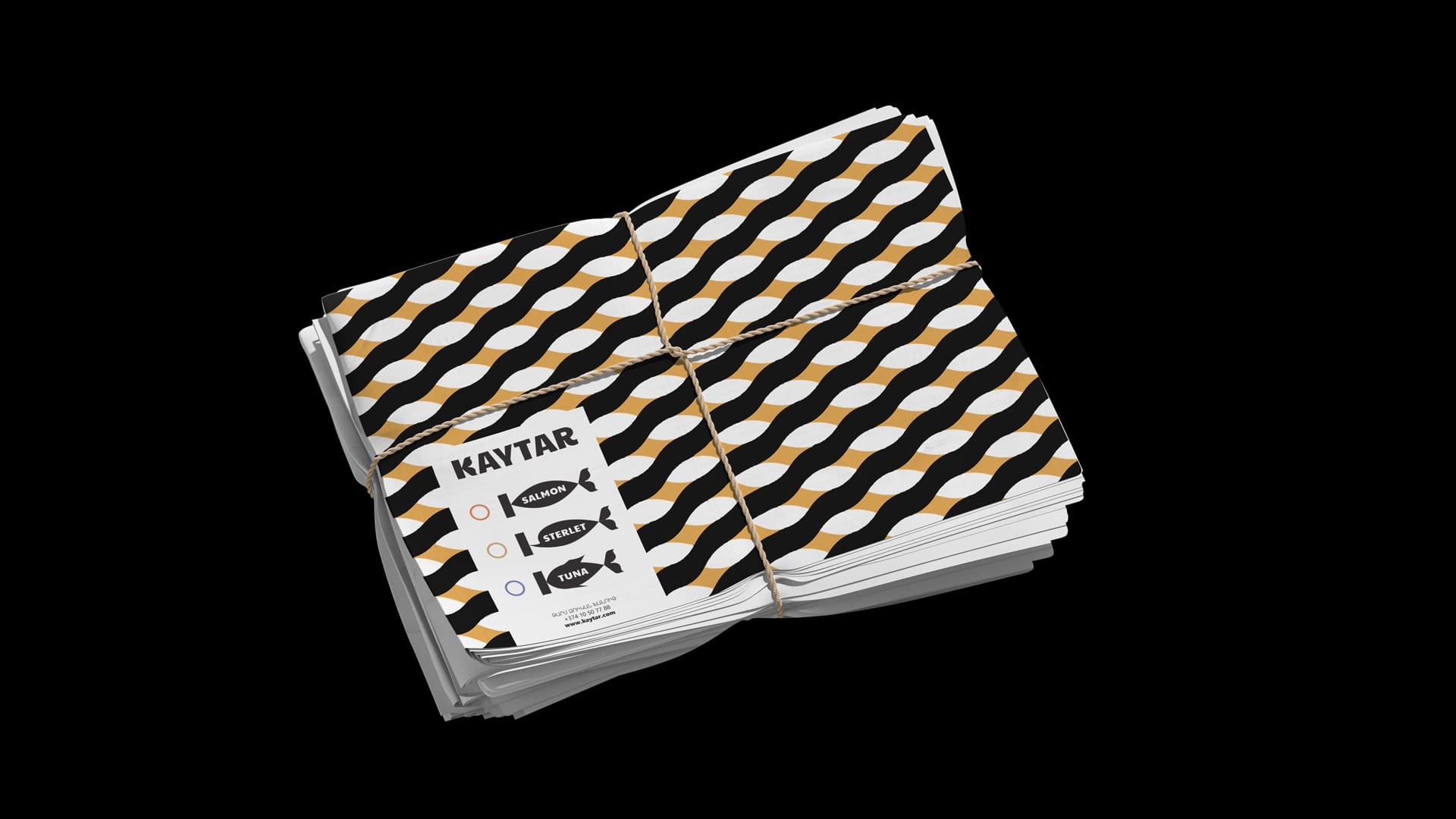
PRINT DESIGN
DIGITAL DESIGN
NAME AND BRAND PROMISE
VERBAL BRAND PLATFORM
COMMUNICATION PLATFORM
-
CLIENT
The brand name was inspired by a term closely associated with fish. In the modern dictionary, the word Kaytar translates to cheerful from Armenian. During our research, we found that in Harutyun T. Gayayan’s Dictionary of the Armenian Language, published in Cairo in 1938, the nouns lukhak (լուղակ) and kaytar (կայտառ) are listed as synonyms for the word fish. Since kaytar is most commonly related to the character of fish, we chose it as the brand name, reflecting its strong connection to the vibrant nature of fish.
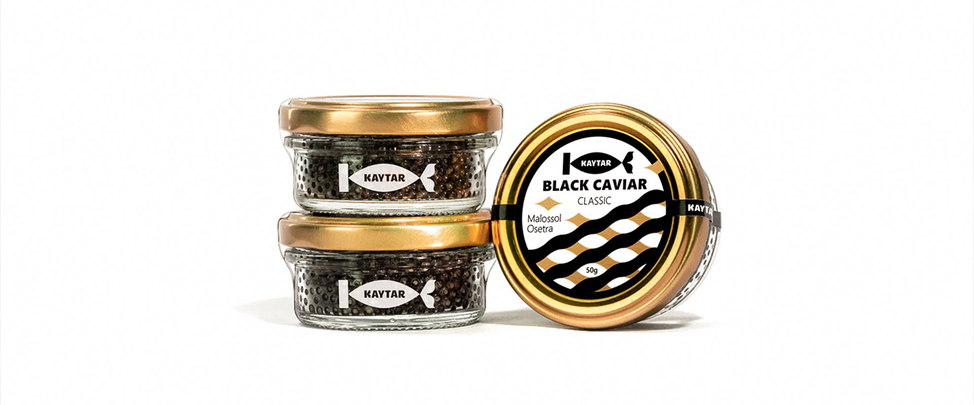
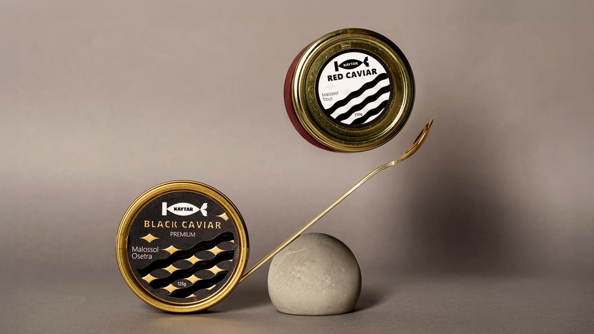
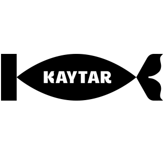
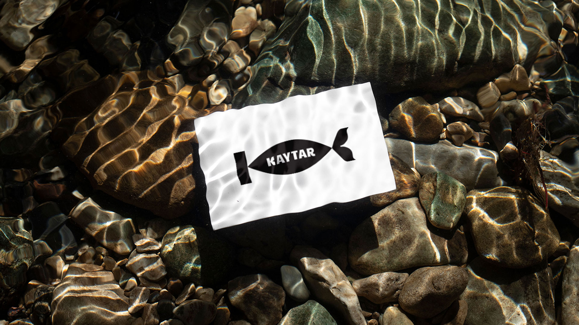
The KAYTAR logo consists of a symbol and a wordmark. The symbol incorporatesthe letter “K” from the wordmark, enhanced with analmond-shaped element that resembles a fish. Within the almond-shaped, the wordmark “KAYTAR” is displayed in capital Latin script, designed with a custom font. The protruding parts of the letter “K” are stylized to mimic a fish tail, reinforcing the brand’s connection to its theme.
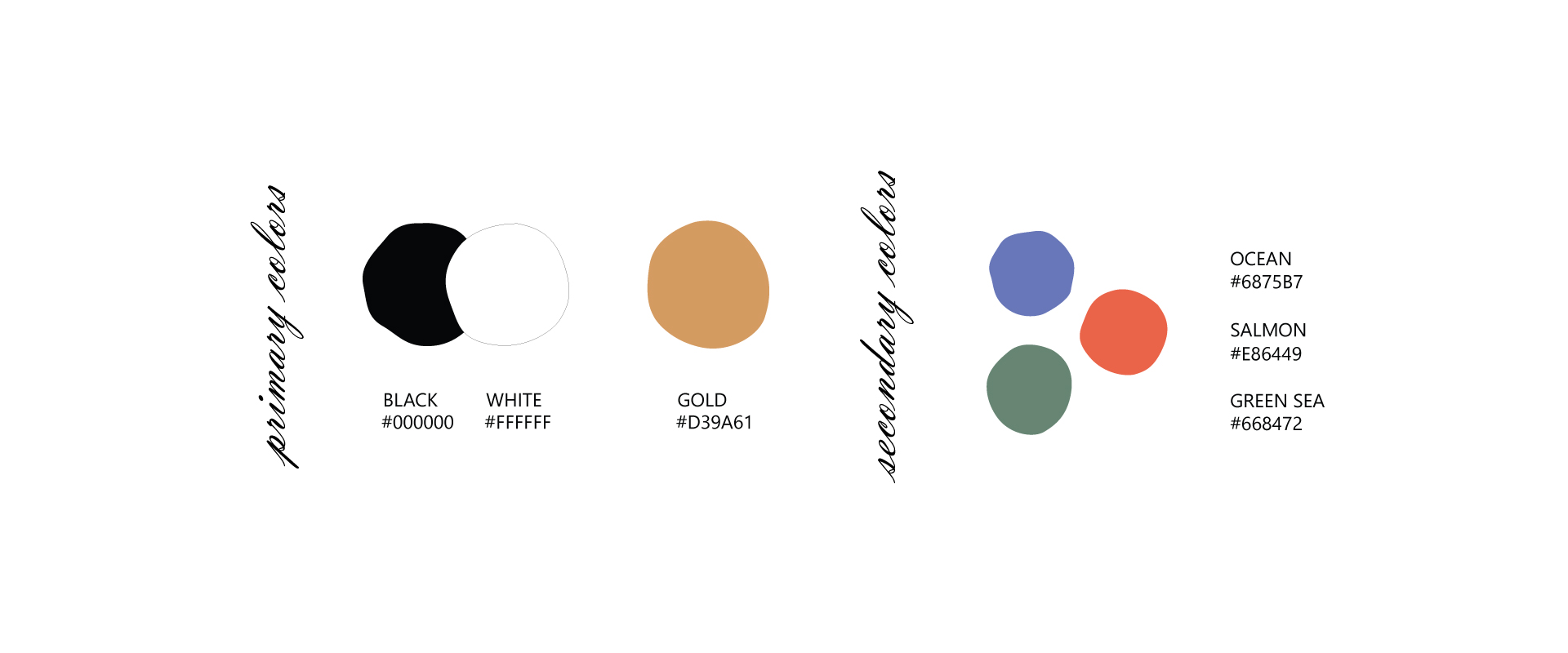
The black and white colors lend the logo a minimalist and memorable appeal, reflecting the simplicity and perfection of the brand. The gold color emphasizes the high-end and premium quality characteristics of the brand. The secondary colors - red, green, and blue - represent the vibrant diversity of the marine world. The illustrations draw inspiration from fish scales, arranged symmetrically to create a pattern reminiscent of water waves, blending the essence of marine life with visual elegance.