-
SEE Expo & Dialogue Branding and Marketing
For the first time in Armenia, Job.am organized an expo-conference on energy efficiency and renewable energy. A brand platform was created and a marketing campaign was executed by the MAROG team.
This event offered companies in the sector a unique platform to present their activities, engage in discussions, establish business contacts, and present career opportunities.
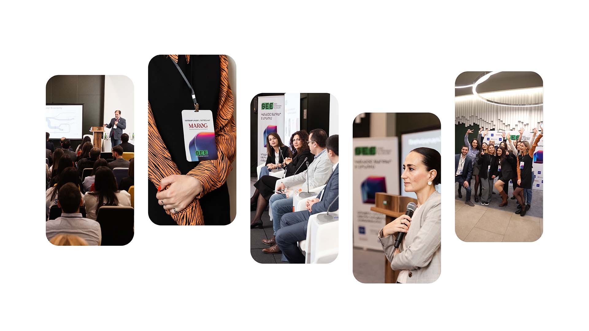
Along with the exhibition, the professional conference brought together companies, specialists, and representatives from the private, educational, financial, public, and state sectors. At the end of the conference, Job Talks were also held, with the purpose of giving participating companies the opportunity to gain visibility, form the image of a desirable employer, and introduce visitors to their business environment and vacancies.
-
DELIVERABLES
NAME AND CONCEPT
COMMUNICATION PLATFORM
BRAND VALUES AND CHARACTER
LOGO DESIGN
VISUAL BRAND PLATFORM
ADVERTISING CAMPAIGN CONCEPT AND IMPLEMENTATION
EVENT BRANDING
-
CLIENT


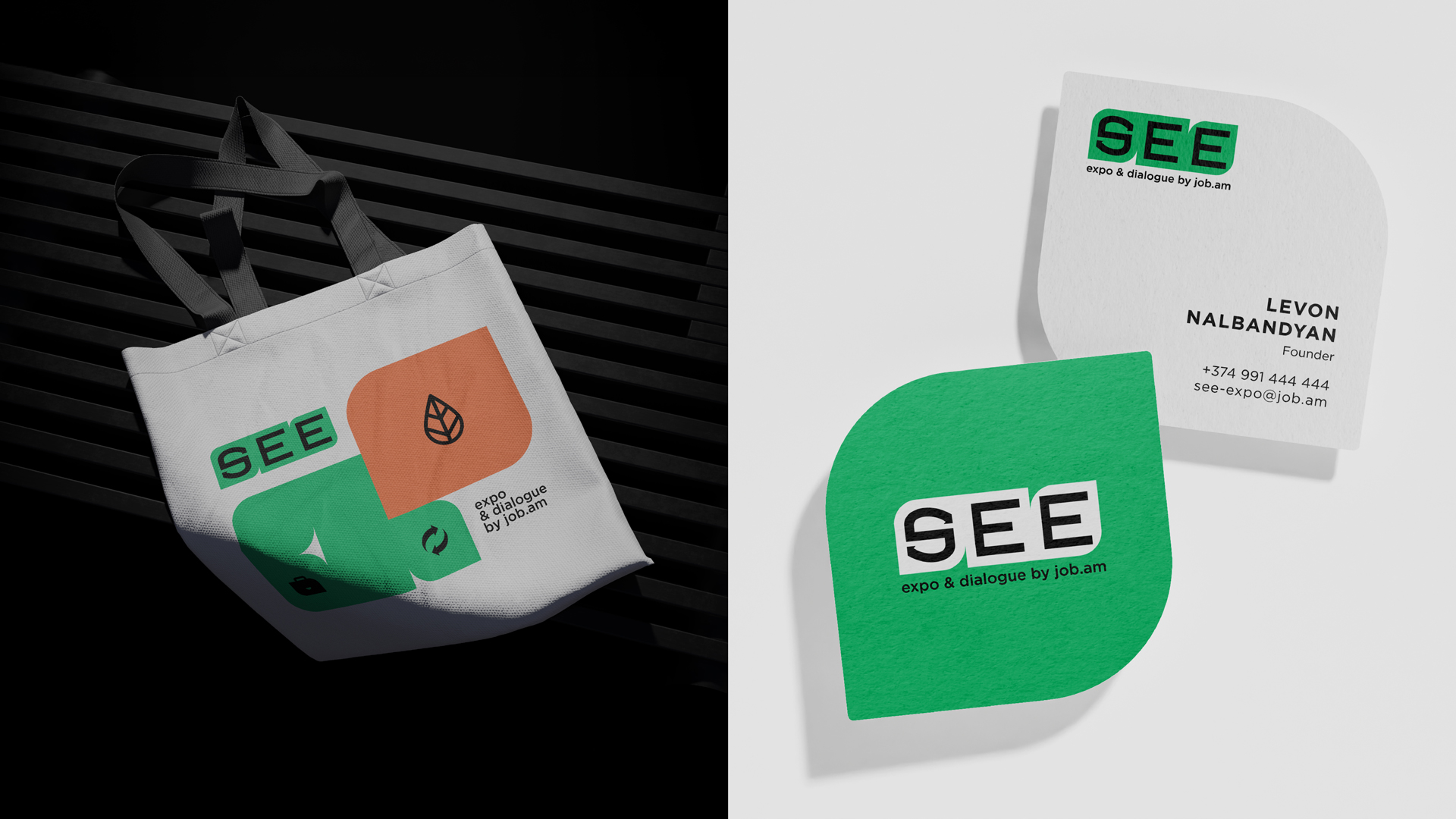
The brand name SEE symbolizes envisioning the future of the green economy and highlighting the sector’s growth in Armenia.
It is also an abbreviation for Sustainability & Energy Efficiency EXPO. The name directly reflects the EXPO concept, as well as an invitation to visit the expo, “see” the companies working in the field, and for companies to “see” the opportunities to present their activities at the expo, establish business contacts and find qualified specialists. The following key messages were formed in connection with the name: See sustainability, See the benefits of energy saving, See the potential of renewable energy, See your career opportunities, See the green economy․
The following key messages were formed in connection with the name: See sustainability, See the benefits of energy saving, See the potential of renewable energy, See your career opportunities, See the green economy․
.jpg)
-
The brand values were developed during a workshop with representatives from the organizing and partner organizations. They were summarized around five core values: Respect, Accessibility, Inspiration, Cooperation, Innovation
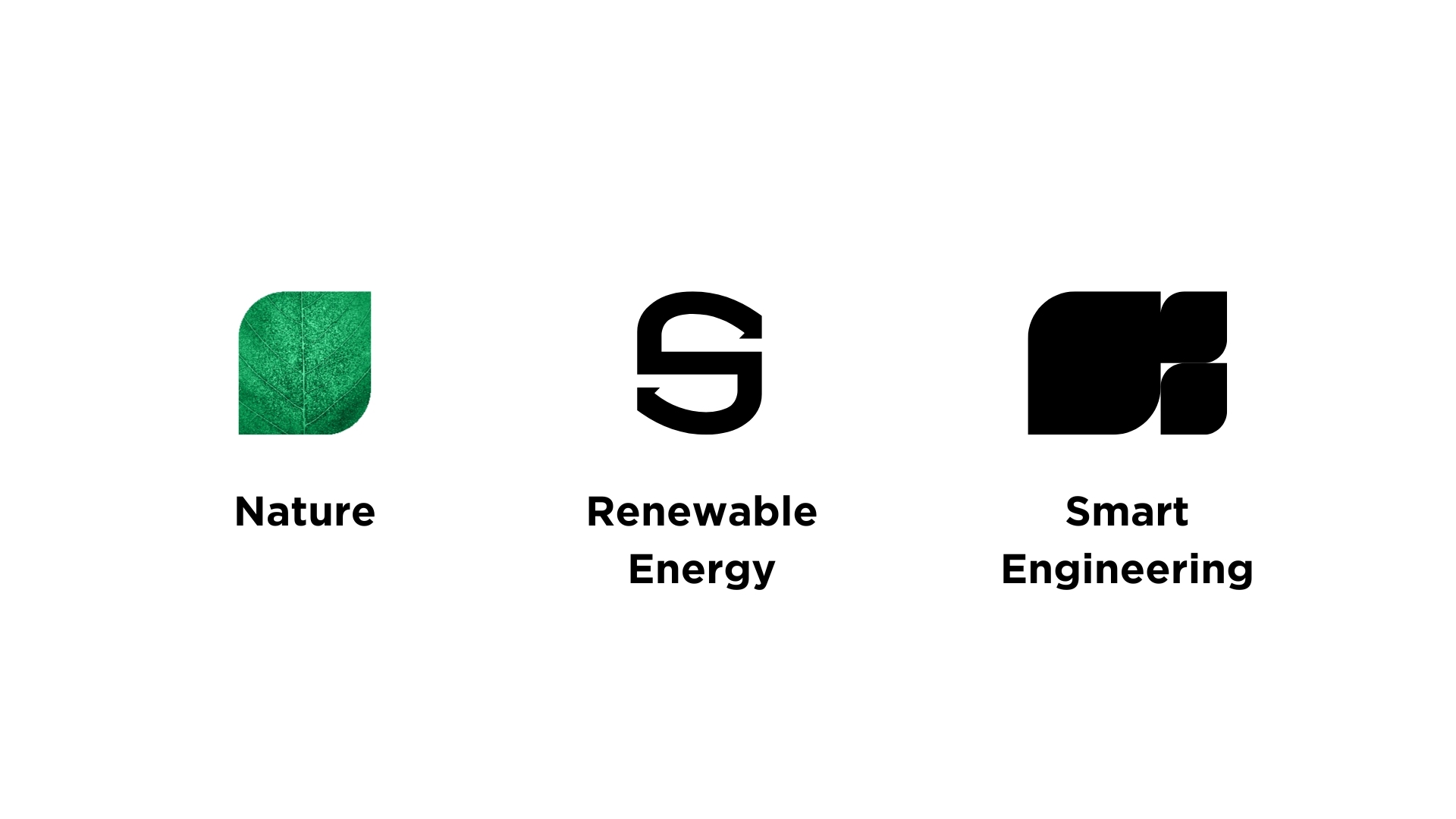
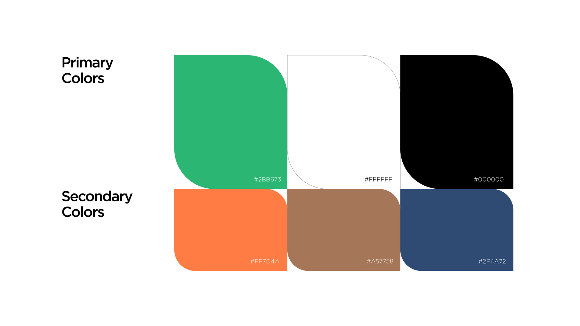
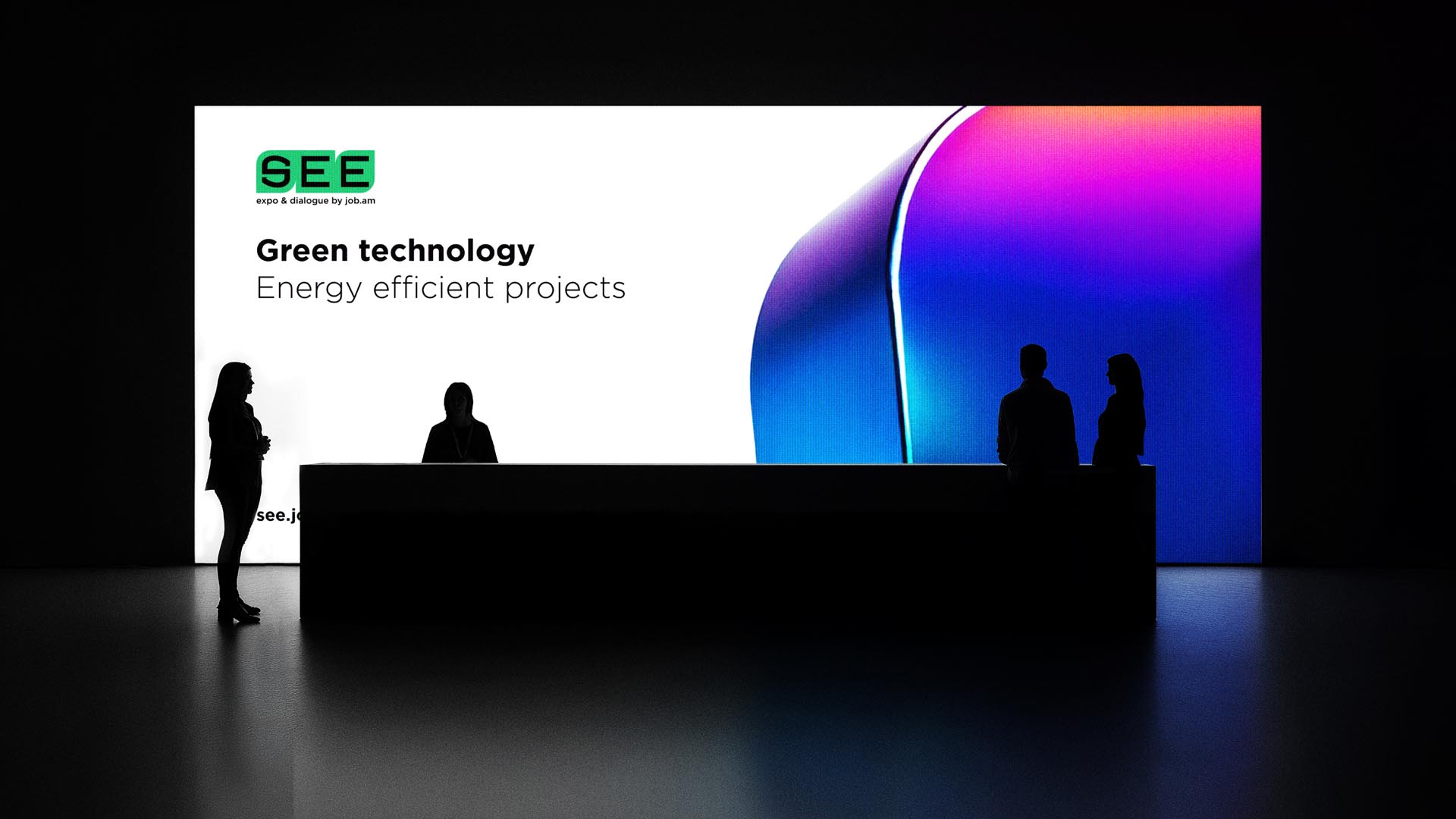
The visual identity aligns with the event’s concept, goals, and mission. It features leaf-shaped elements symbolizing the connection between the green sector and technology. The colors used also reflect the green and energy-efficient theme.
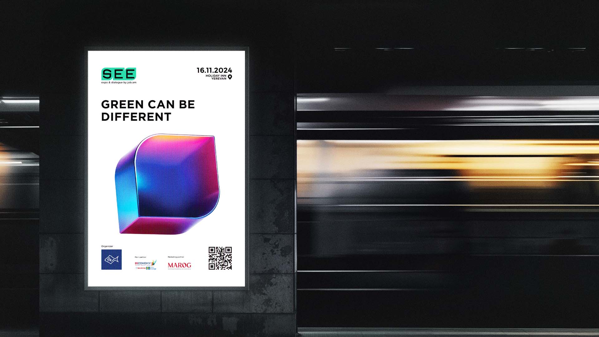
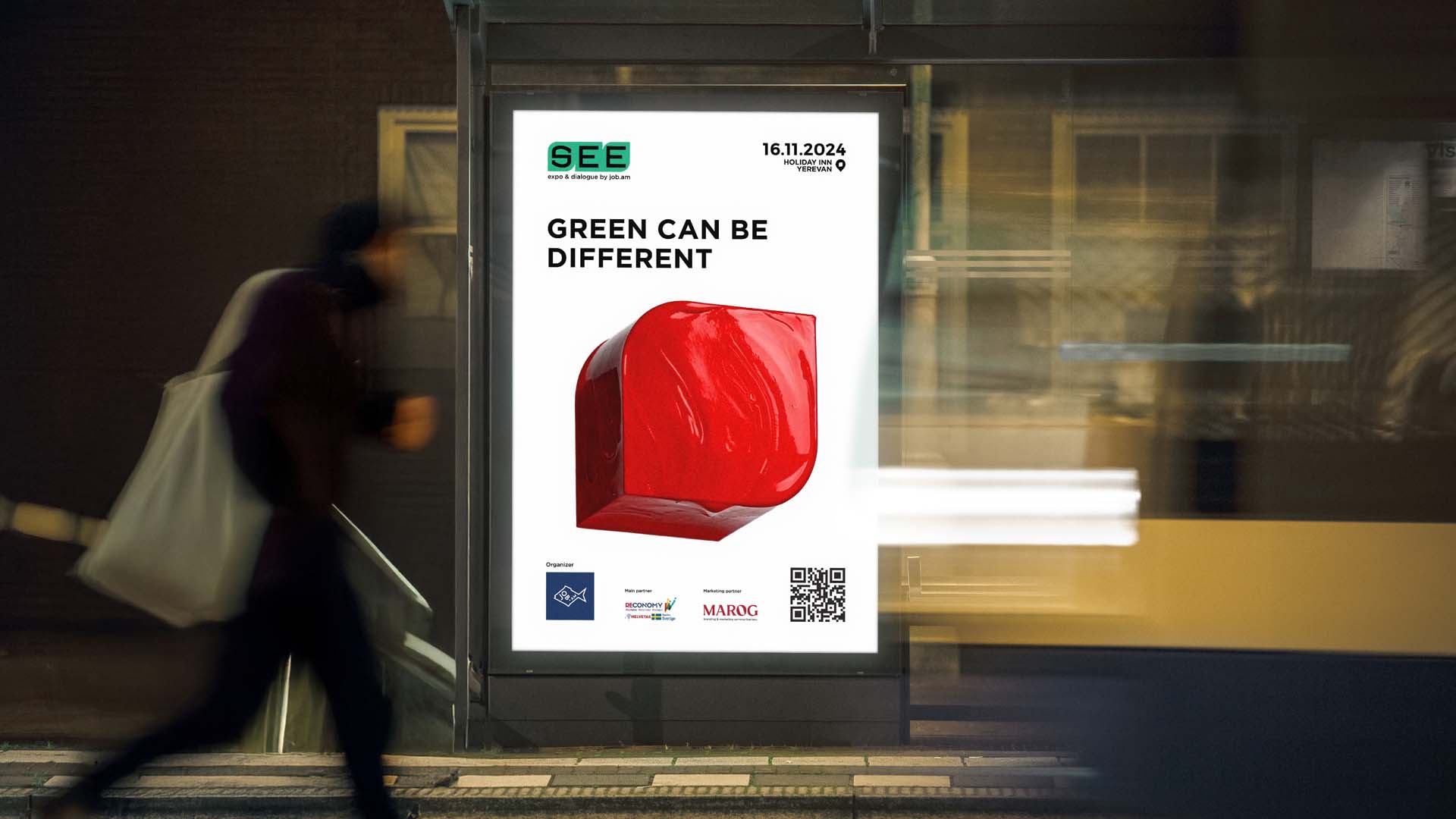
To promote the event, a landing page was created, with the possibility of registering visitors and participating companies, and advertising materials for the event were distributed on the Job.am platform’s social media pages and website. Separate content presenting the event’s details and conditions was developed and distributed for the social media pages.
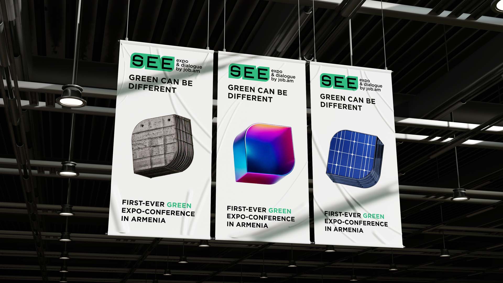
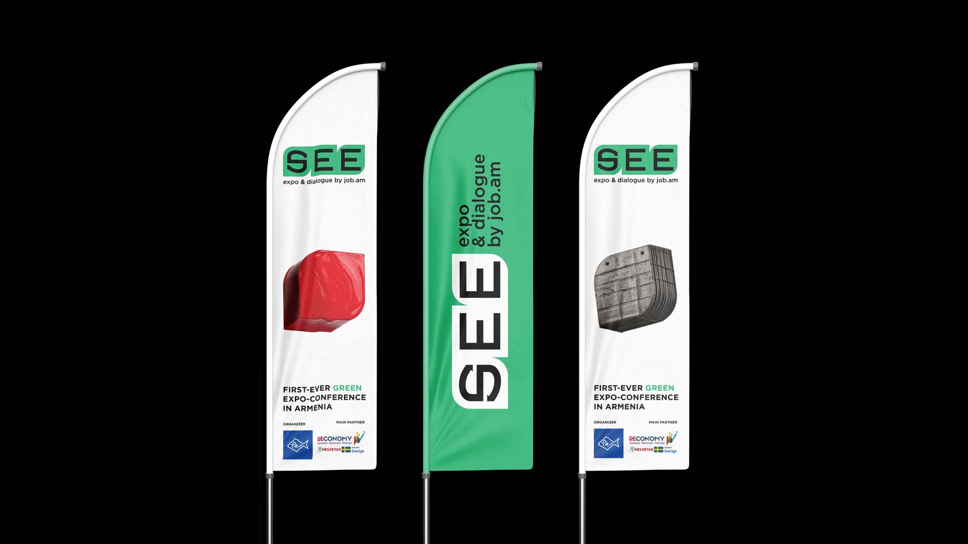
In order to make the event unique and attractive, as well as understandable, we created the advertising campaign slogan “Green can be different”, which was accompanied by graphic images and colors of various materials presented by the brand identity. The event was preceded by an advertising campaign on OOH, including city format banners and LED screens. Posters featuring the main visual concept were displayed at several Yerevan metro stations, several downtown intersections, and bus stops near universities.
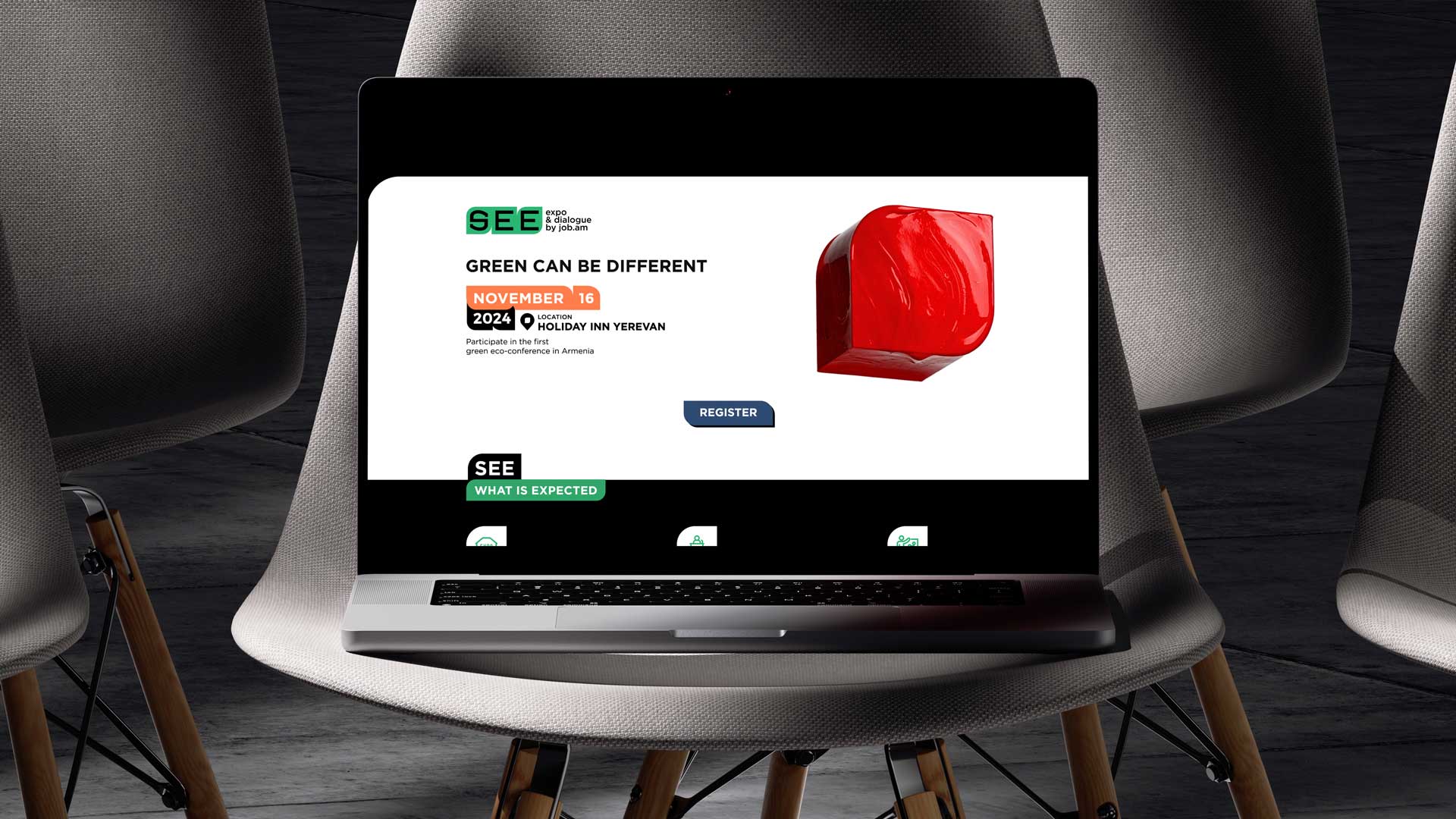
On the day of the Expo-Conference, we designed the area with visual identity elements, branded banners, posters, videos, agendas, informational animated videos, and guides were available in the area, and the design of the pavilions of the companies participating in the Expo was consistent with the brand's visual identity.
.jpg)





.jpg)
.jpg)
.jpg)
